Case Study: Departure Gate POS App
Gate Sales POS App
The Gate Sales App allows for airline staff to charge passengers who arrive at the departure gate, with more bags than they have paid for. The crew can charge the passenger to check the bag in before they board. The app also allows for passengers to purchase a seat upgrade at the departure gate before boarding. With stronger restrictions on the size, weight and number of carry-on bags their passengers can have, this POS app at the Departure Gate has become an important and lucrative revenue stream for Airlines.
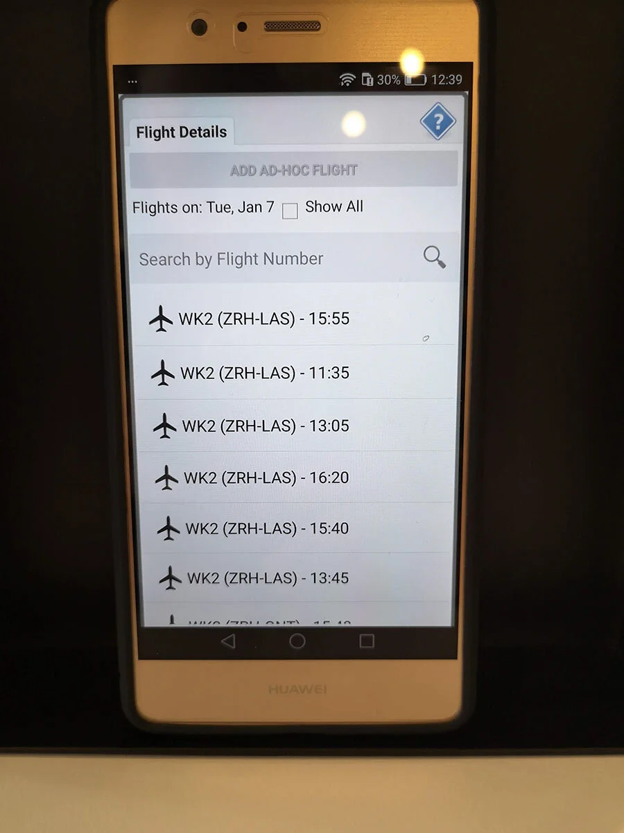
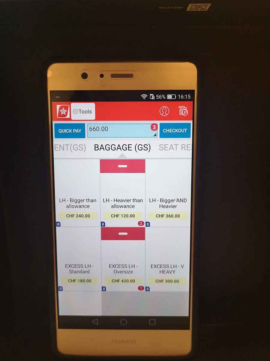
Current Gates Sales App Interface
Redesign Project
I was the Product Design Lead for the Gate Sales POS app redesign. The Gate Sales app had become a key revenue stream for our airlines with more airlines looking to implement it. The initial build of the Gate Sales app was a reworked version of another POS app and didn’t quite meet the requirements that were now asked of it.
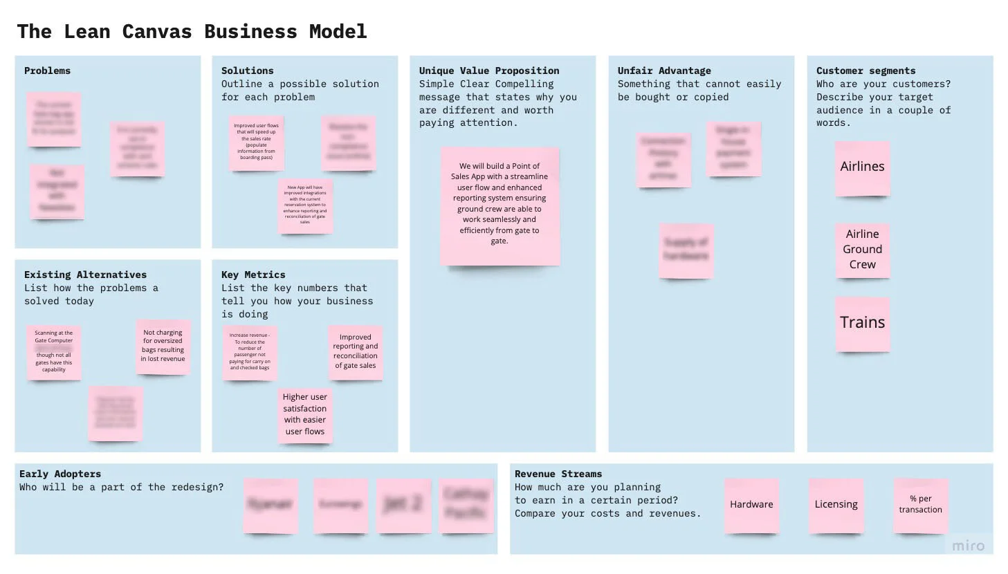
To kick start the research I led the build of a Lean Canvas Business Model. This would quickly help map out the business strategy that will influence the new solutions. This needed to be understood in order to drive the research in the right direction. The business canvas mapped out our assumptions and highlight the gaps. It gave direction on what should be thought of next. Gaps were to be expected and provided a good starting point for the research
Initial Research Plan
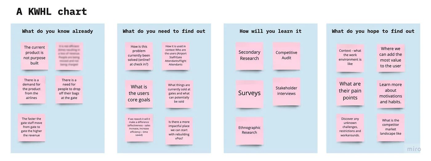
A KWHL Chart was built to provide a visual organiser to help see what we know and what we want to learn, how we will learn it and what we hope to learn. Once this was filled out we could put together a literal research plan in the form of a Research Logic Model table.
Empathise Stage
To create an understanding of the problem we needed to generate a high volume of foundational Product research. A higher volume of this research would be qualitative. To gain empathy towards our users and achieve a deeper insight into our product we used all the methods below.
Radar graph of overall scores
Heuristic Evaluation
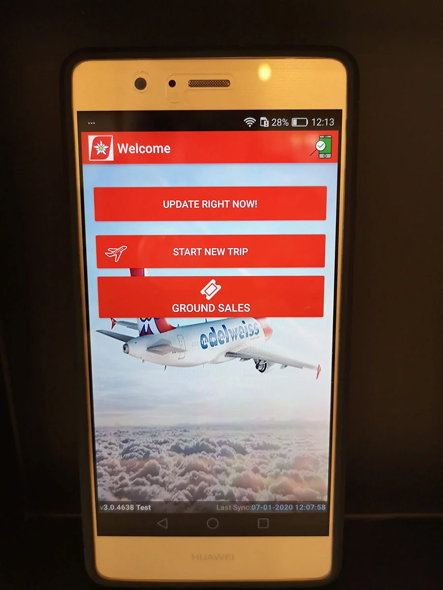
To kick start the research a Heuristic Evaluation was run on the app itself. Heuristic evaluation is a key part of any redesign and tests the apps alignment with recognised usability principles. The app was graded against the predetermined set of Jacob Nielsen heuristics. The benefit of the evaluation is that it allows for a quick and cheap option in identifying a lot of the key usability issues.
Results snippet: Error Prevention - There isn't a visual hierarchy on the login page indicating to the user that they need to “Update Right Now” before clicking "Ground Sales". The wording "Start New Trip" is also confusing with “Update Right Now” and “Ground Sales” beng the first set of tasks a user needs to interact with.
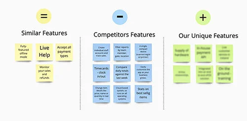
Competitive Benchmarking
Competitor analysis was run to assess the strengths and weaknesses of our current and potential competitors. This analysis provided both an offensive and defensive strategic context to identify opportunities and threats. We placed the results into 3 categories, similar features, competitors features and our unique features to help clarify our strengths and weakness.
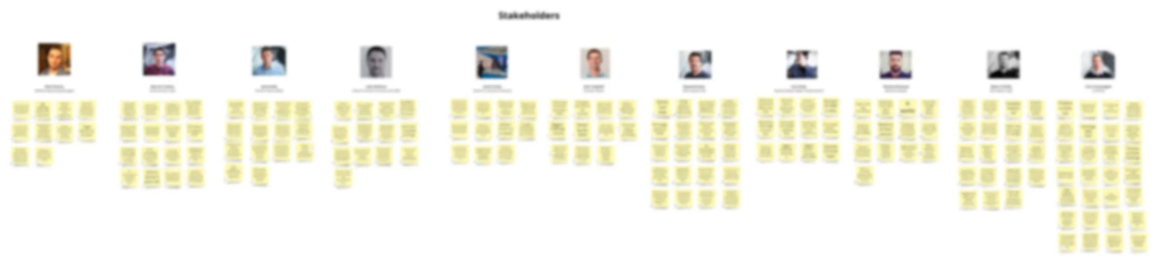
Stakeholder Interviews
By interviewing our stakeholders, we got a clear understanding of their expectations, vision and core goals for the project. This allowed us to make sure our research plan and design process met these goals. The interviews were extremely valuable and generated a large volume of Product data. The findings were placed into an Affinity Map so it could be analysed and synthesised to find common company patterns and themes.
User interviews
We ran multiple airline user interviews to learn about our users basics needs, wants, areas of concern, pain points and motivations. We also wanted to gain additional behavioural data and insights by observing body language and listening for verbal cues.
Key Findings
Currencies - They would like an option to pick a default flight currency, as depending on the flight route different currencies are requested
Interaction - The crew rely heavily on navigating the inventory list using the thumbnails
Application Features - There was an overall opinion to reduce the features set rather than add new ones
User Feedback - If a payment fails they don't know if it is an issue with the card (block listed) or the device.
Data Analysis
Data analysis is a key part of all research. It anchors down the “What” to inform the “Why”. A fun deep dive into data analytics was in planning an observational research trip to view passengers being charged for excess baggage by our Departure Gate Sales App. We needed to find a flight route with a high turnover of charges. This would favour our chances in seeing the app in action. To do this we reviewed the departure baggage charges data gathered over a 3 month period from a single Airline. Out of the higher sales revenue routes that we identified, we selected a Bristol flight that flies every Friday with an average of 3 to 4 bag charges per route. The data analysis paid off and we observed 5 baggage charges at our departure gate.
Key Findings
Highest revenue generating Airport was London Stansted
Highest revenue generating flight was one between Germany and Spain
Thursday was the highest revenue generating day of the week

Observational Research
The observational research is a qualitative method where we observed the Gate Sales app being used in a live environment, as well as the self check-in machines to see the user flow of the competition. Though data analysis we worked out the best flight to see the app in use. Our flight was a full flight with groups heading away for the weekend. We observed 5 people in total being charged for large cabin bags in the non priority line at the departure gate. We were also able to have a few quick conversations with the ground airport staff. With the new research data obtained we were able to bring valuable insights into our Persona, Empathy and Journey Map workshops.
“There are always bag charges for every flight”
Define Stage
It was time to run workshops to define the problems. The workshops not only turned the research into tangible issues but also aligned the teams and brought the user into the office. Below are all the workshops that were run.
Passenger and User Persona Workshop
Our Persona workshop enabled us to characterise our target users to make better product decisions. We used the teams unique insights and experience along with the user research data gathered to help build high level assumption personas. It was a great success and also brought the team closer aligned to our users by talking through their motivations and pain points together.
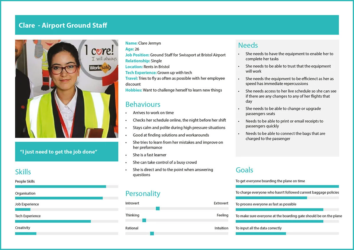
User Persona - Clare Airport Ground Staff
Passenger Persona - Killian the budget flyer
Passenger Persona - Suzanne the Business Traveller
Empathy Workshop
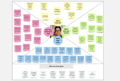
We ran an empathy mapping workshop as a way for us to have deeper understanding of our users. We did this by visualising their attitudes and behaviours which will allow the team to make more precise and efficient design decisions.
The workshop was very successful. We were able to create a believable live user environment. This gave us a good baseline context for our personas to live in. The maps showed a common understanding of the users needs.
To make sure that we had actionable results at the end of the workshop we reviewed all the current behaviours and matched them with a list of new behaviours we wanted our product to help change.
Old Behaviours > New Behaviours
Unsure if app is updated > Confidence in running current version
User and Passenger Journey Map Workshop
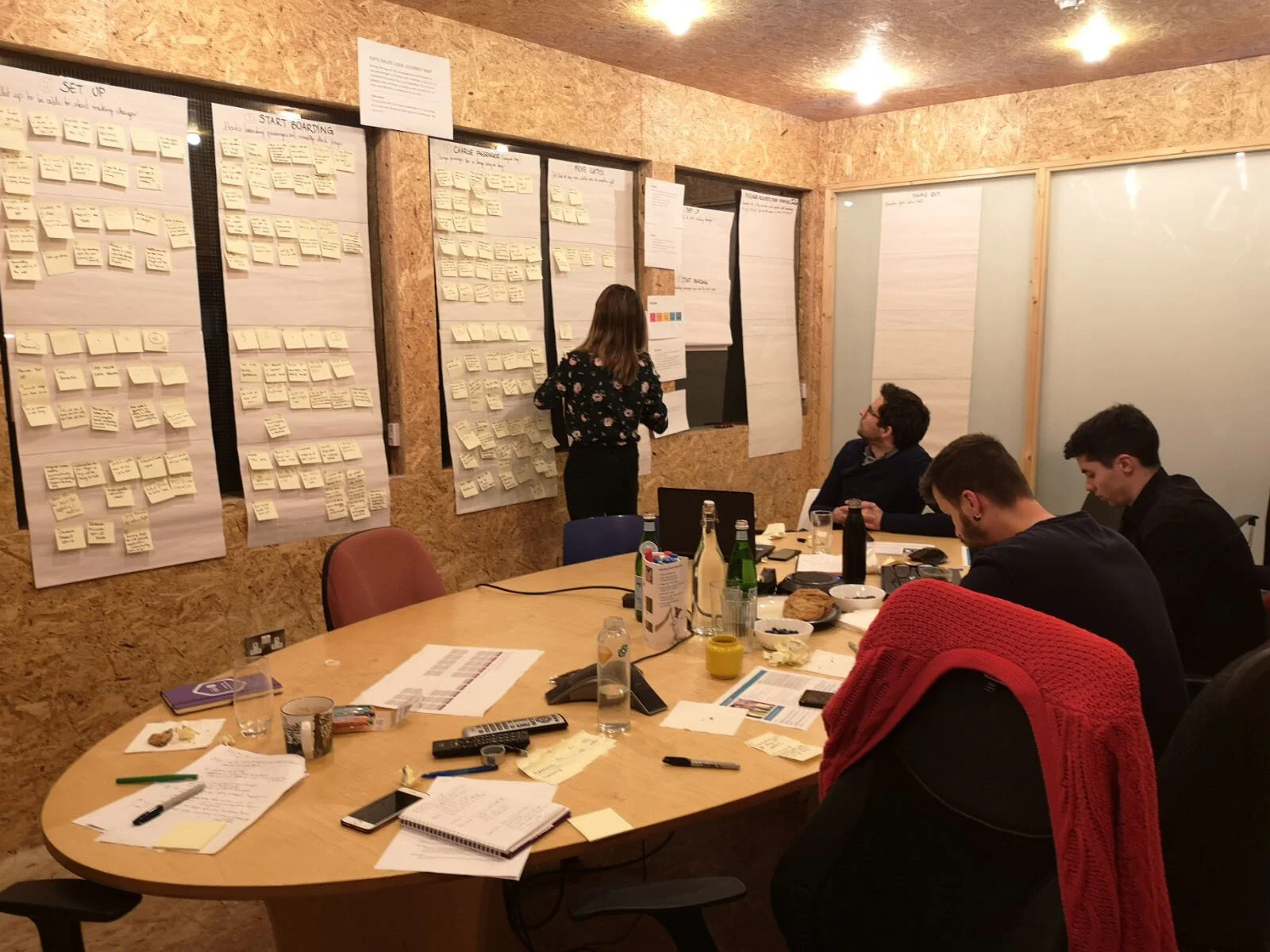
We ran a Journey Mapping Workshop to create a realistic visualisation of the current process our users goes through to complete a task in a chronological order. The purpose of this journey map was to diagnose issues with the current experience. The information gathered was key in building a new framework that would work more efficiently and effectively for our users.
Snippet of Findings:
Duplications and inefficient user flows, which during time sensitive tasks is a big pain point for our users.
It showed the juggling of multiple pieces of hardware for a single task
It show missed opportunities of giving our users valuable scheduling and reporting information
It highlight opportunities to digitise receipts and remove hardware
Ideate Stage
It was time to move onto the exciting stage of ideation and generating new ideas. Below are all the methods used to create new solutions.
Brainstorming Workshop
Now that we had completed our discovery research and identified the problems, it was time to generate ideas. We documented all the problems that we wanted to solve. Before the workshop we generated as many ideas individually before bringing them together to share. We kept an open-minded and worked through the designs, strategy and user flows. The goal was to create a large number of ideas which could potentially inspire newer, better ones. All the ideas were sketched out then narrowed down into the best, most practical and innovative ones.
Story Mapping Workshop
The team took part in identifying and agreeing on the initial steps of the user journey and assigned user stories below each of them. We used this method for arranging the user stories to create a more holistic view of how they fit into the overall user experience. The map was to be viewed as a living specification document.
Initial sketches were placed above each step to help the team visuals what requirements were needed. The user stories were then populated into MVP Backlog.
Prototype Stage
This is where we started to invest in the new ideas and see them take shape.
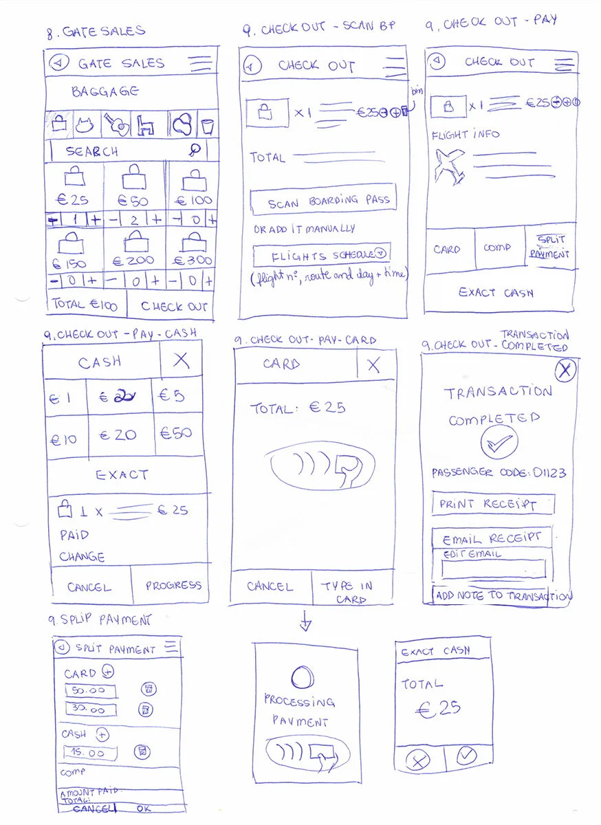
Low Fidelity UI and Paper Prototype
The final sketches were developed out into Low Fidelity UI bringing the new ideas to life in an early inexpensive way. This would allow us to run it through usability tests to reveal any problems before too much time was invested on the interface.

Test Stage
This is a crucially important part of the redesign. We needed to remove ourselves from the designs to see it through fresh eyes. It is the only way to truly validate the usability of the screens. This final stage is also an iterative process, the results generated during the testing phase will be used to redefine one or more problems that our found. This is where we can validate our assumptions and see what worked and what didn’t and then iterate.
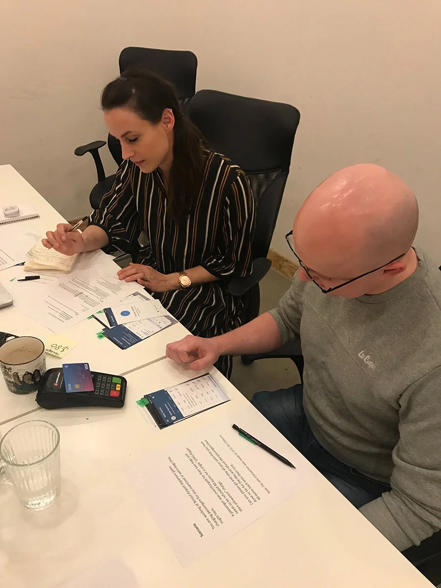
Usability Test
We ran a usability test with participants from different Retail inMotion departments to test out the new refund user flow. We used a paper prototype as it was quick to create allowing us to get early honest feedback. With paper prototypes people feel more comfortable giving feedback than they would on a digital interface as it feels less finalised.
To make sure that we could pull quantitative results, each participant was given scenarios and tasks to complete. Each task was broken down into single actions which was scored from a range between 1 (unsuccessful) to 10 (successful).
The tests highlighted simple changes that needed to be addressed. The pain points were defined in a brainstorming session and new solutions were proposed. The UI was then refined which resulted in all participants having a successful task completion score. It reiterated how important it is for these usability test to be part of the process.
Overview of Key Redesign Solutions
From all the research, the biggest key issue that stood out was speed. Every change we implemented was critiqued to see if it would provide a more efficient faster user flow for our users. Our users are working on an extremely time sensitive regimented schedule. Research showed that the biggest loss of revenue for the airlines was when a user runs out of time to charge passengers for excess baggage because a flight is starting to board. Any changes that could speed up the sales process would directly result in higher revenue gains for our clients.
The new UI focused on the overall improvements below to be able to deliver our unique value proposition “We will build a Point of Sales App with a streamline user flow and enhanced reporting system ensuring ground crew are able to work seamlessly and efficiently from gate to gate.”
Consistent UI throughout using standard easily recognisable components
Hierarchy of information on each screen to help guide the user through tasks
Feedback on the system status so the user could feel confident during tasks
More control, allowing users to easily change their mind during a task without having to start it again
Allowing users to use recognition rather than recall by providing more visuals, populating previous used data and populating flight schedules.
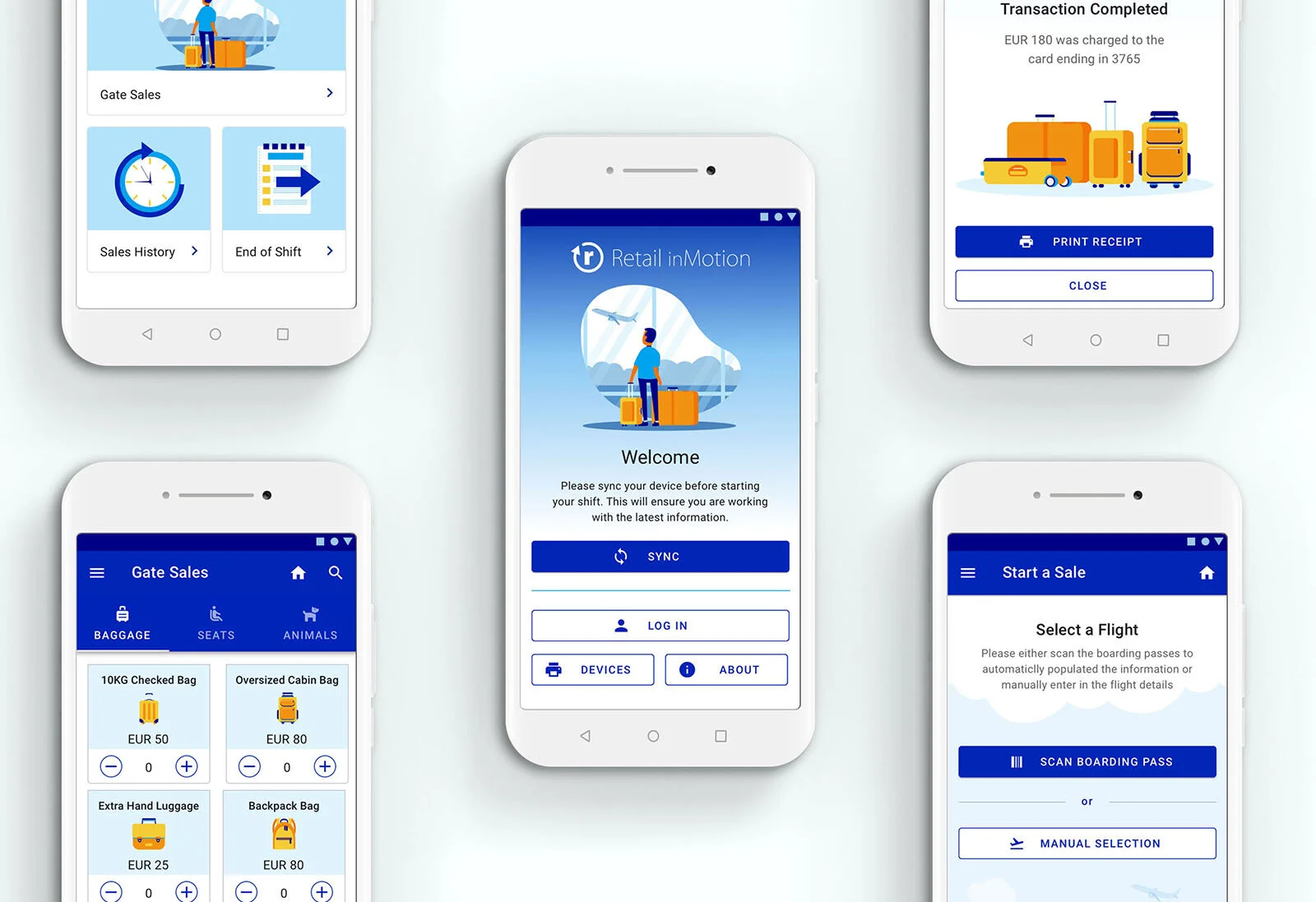
High Fidelity UI
Key Changes
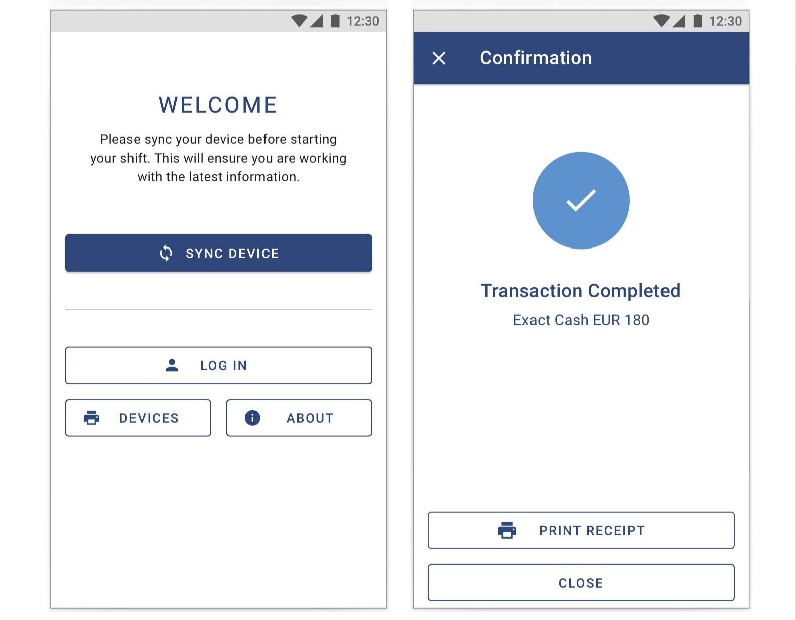
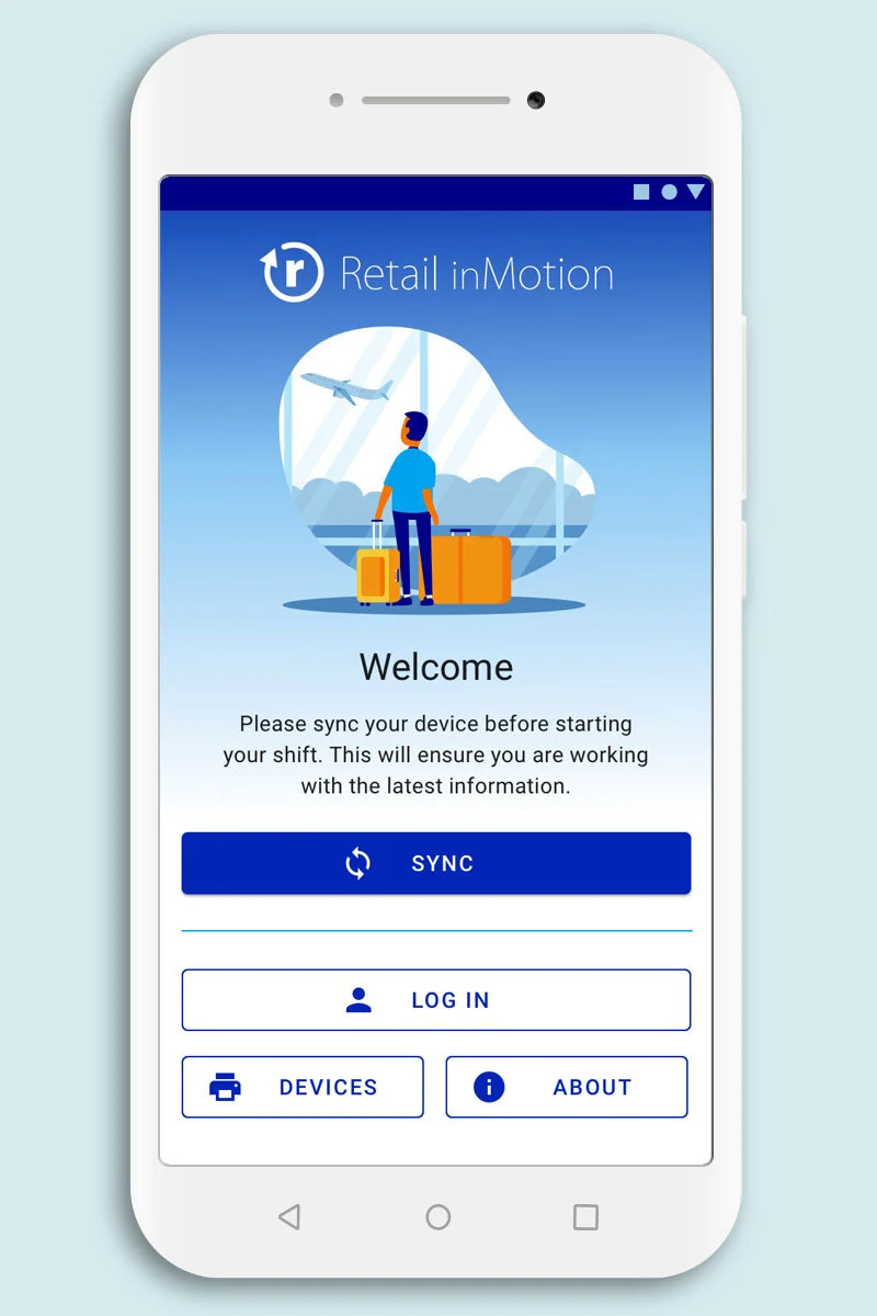
Login User Flow
A new intuitive hierarchical user flow was created. It now clearly shows that syncing is the first step before logging in. This is vital because it updates the device with the latest pricings and products.
There is now visibility of system status with different states for the sync button allowing the user to know if they need to sync, if their device has already synced successfully or if there has been an error with the sync.
Recognisable icons were added to the buttons for quick recognition of tasks
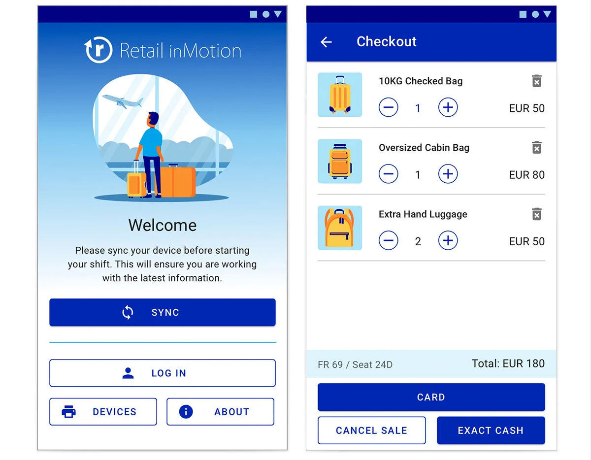
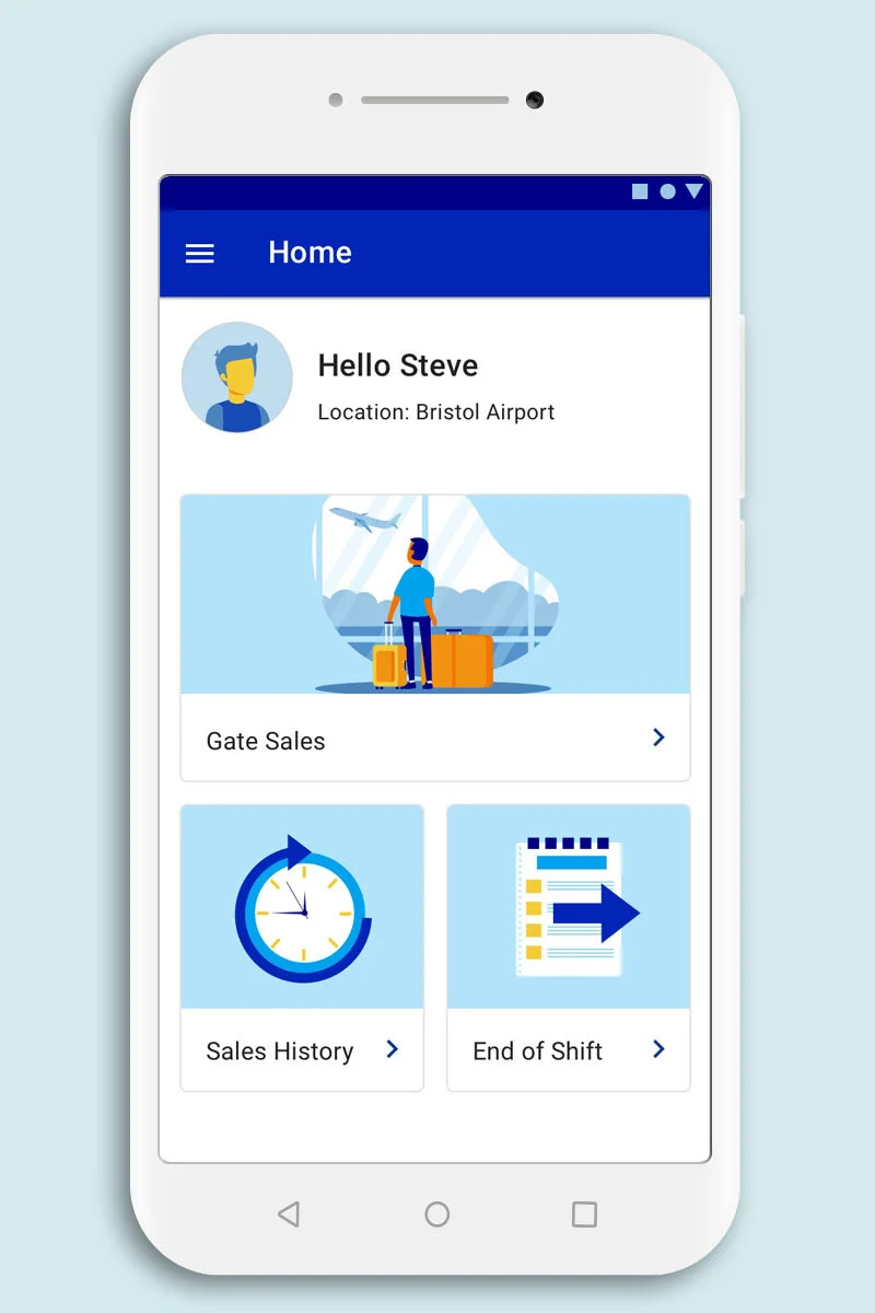
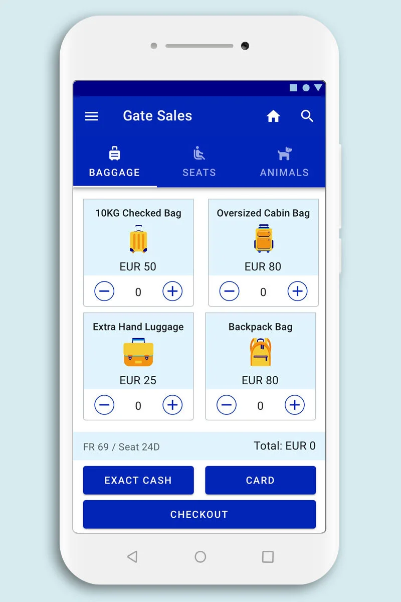
Sales Screen
The new overall revision of the Sales Screen UI now provides a cleaner, standardised, more intuitive interface. There are thumbnails for quick selection through visual recognition and an exact cash button for quick common payments of 25 euros (single cabin bag charge) as well as larger clearer stepper UI buttons on each product card.
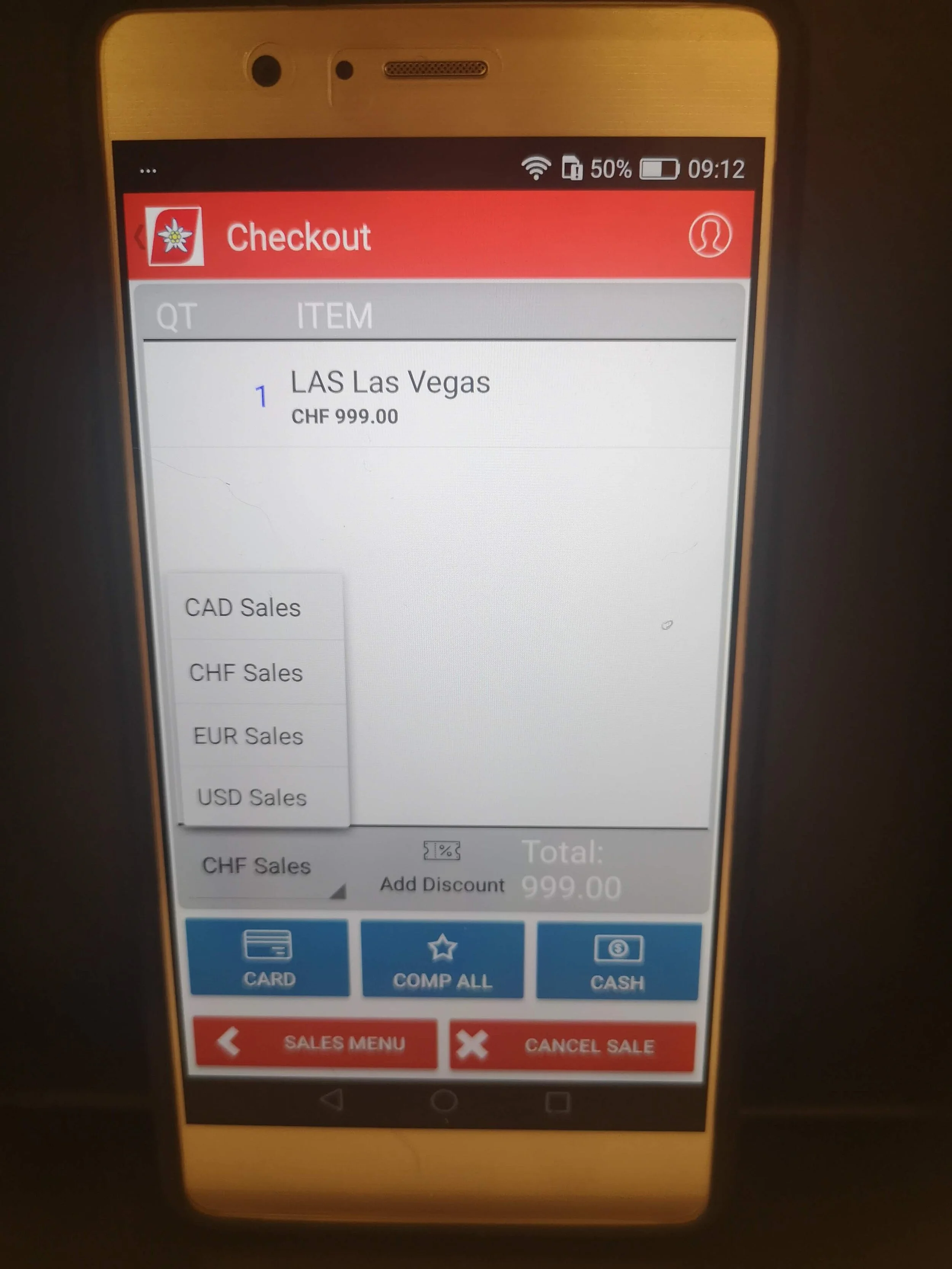
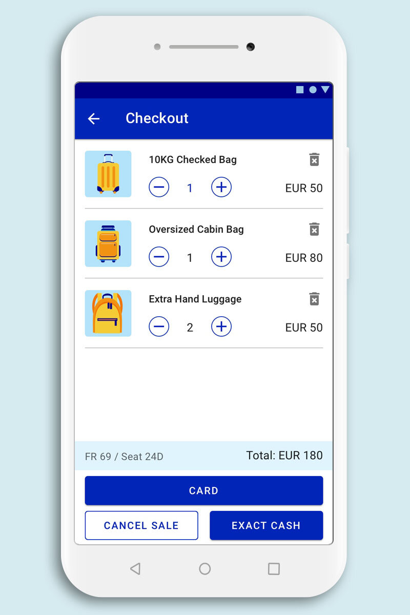
Checkout
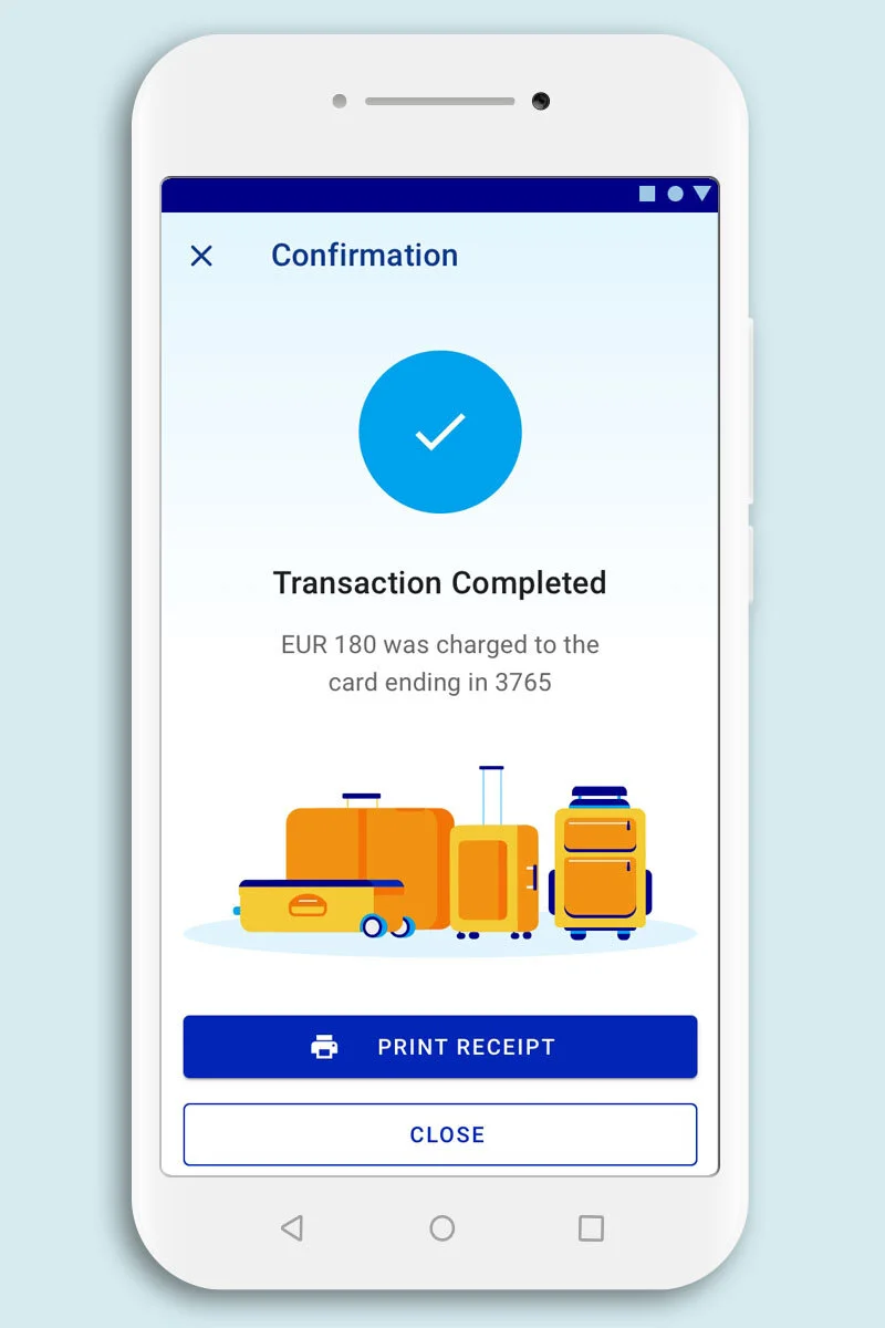
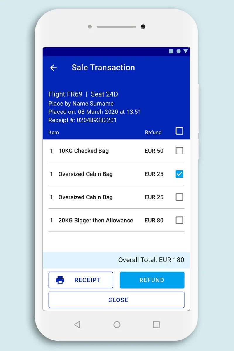
There are now thumbnails displayed for the user which helps with error prevention giving the user visual confirmation of what is being charged
Users can also now delete and edit the quantities of the products in the checkout screen, rather than only being able to cancel the full sale. This gives the user control and freedom during a sales rather than a lengthy process of starting over to make a change.
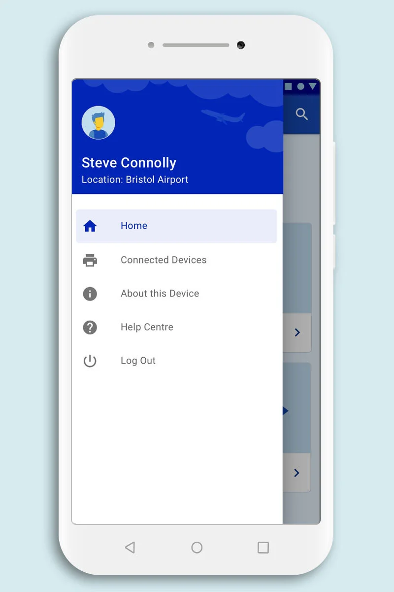
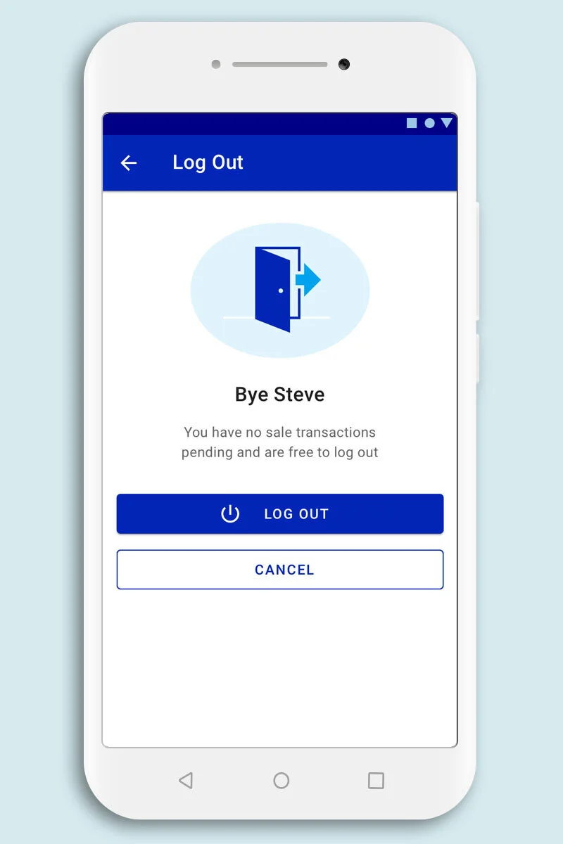
Log out
Previously the only way to logout was to run through a full end of day sales report even if a user had signed in and made no sales. Now a user is able to sign out if they have signed into a device and made no sales.
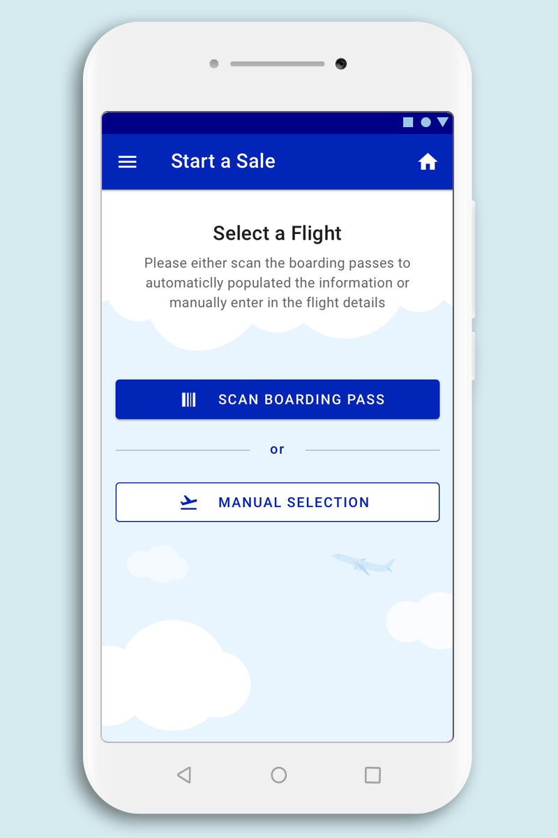
Gate to Gate User Flow
The biggest user flow improvement now enables users to scan a boarding pass to link a sale to a specific flight. The previous user flow required the user to manually select a flight, charge for that flight then run through a full end of day report, sign out then sign back in again to be able to move to another departure gate. Users can now sign in at the beginning of their shift and switch between as many departure gates as they need and only require a passengers boarding pass to register a sale to a flight. This will significantly speed up the users ability to charge more passenger by quickly moving from one gate to another with ease.
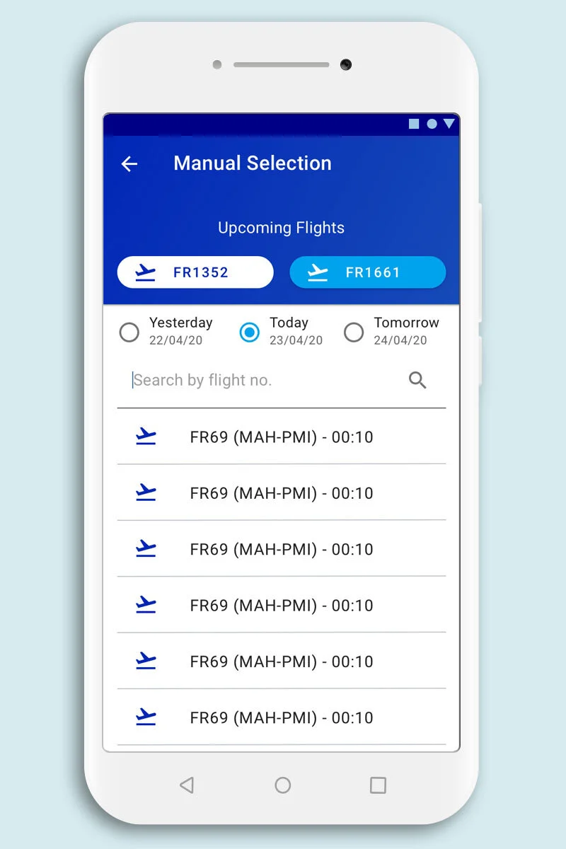
Pre-populated Flight Menu
If a users needs to manually select a flight, the new intuitive interface now shows radio button options to select a day (yesterday, today, tomorrow) as well as quick select button showing the next two upcoming flights which should cover most use cases.
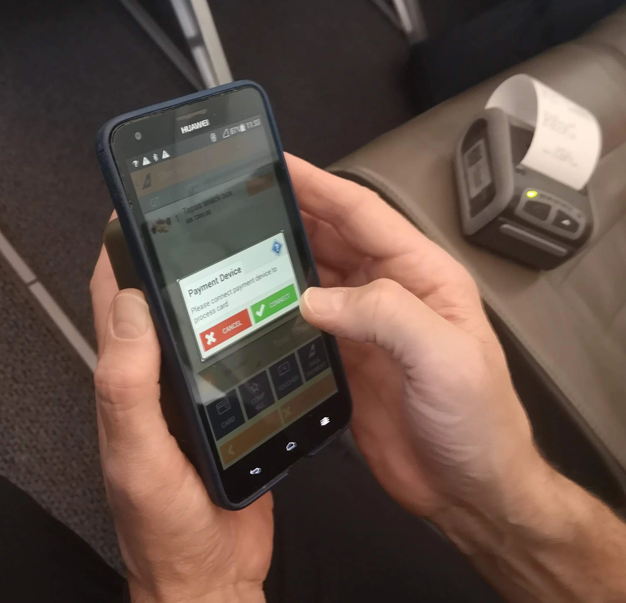
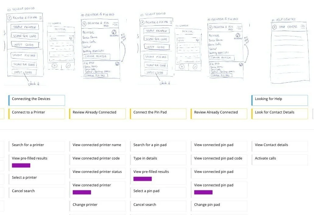
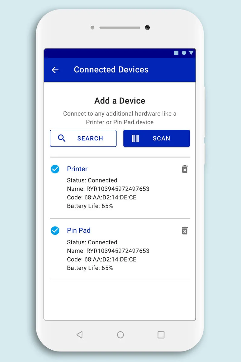
Connecting Hardware Devices
The function of connect a hardware device was made generic. Users can now scan their Printer and Pin Pad barcode back to back without having to go to a another section of the app and scan again. The menu and search list is also now generic allowing a user to select multi devices to connect too in one task.
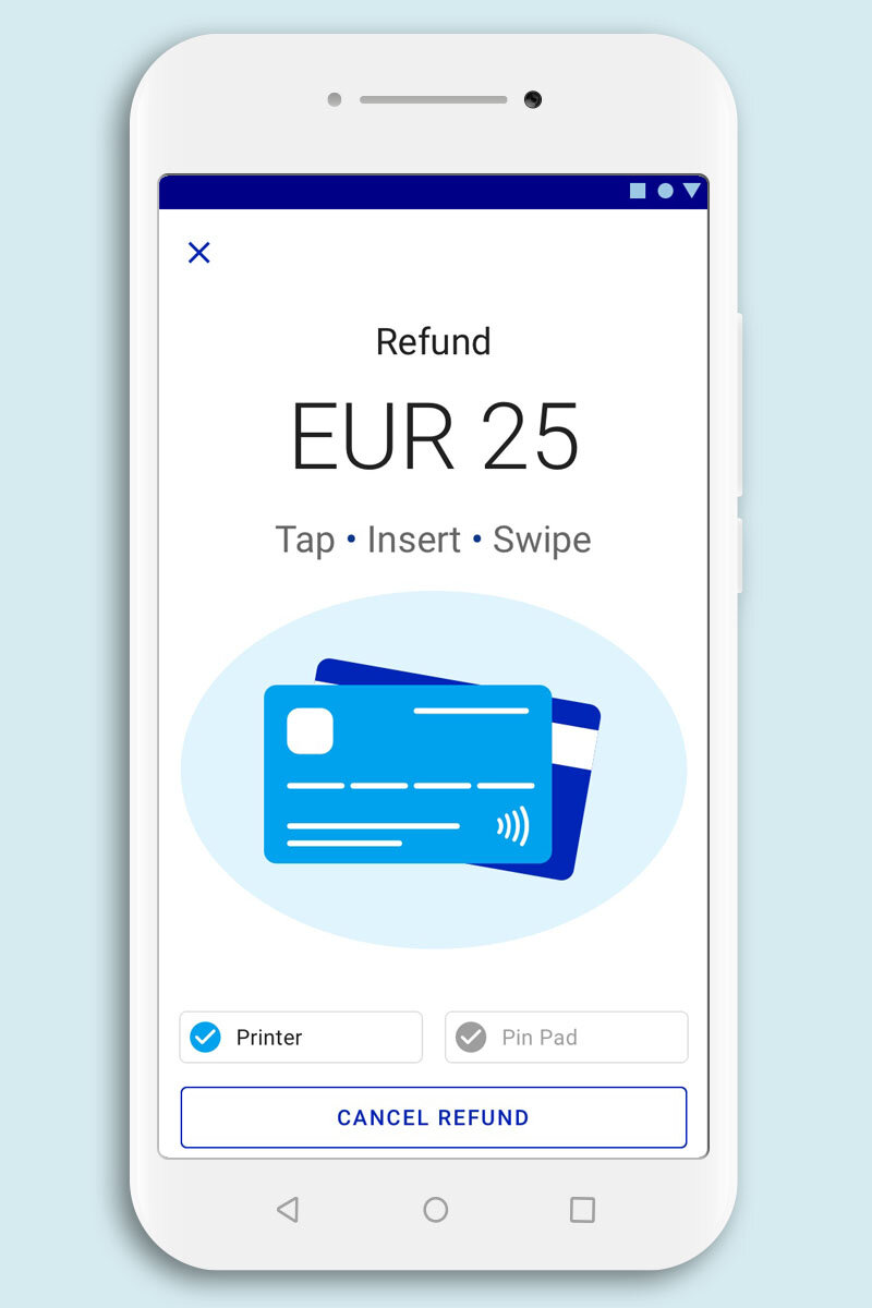
Hardware Device Status (Pin Pad/Printer)
The user can now see the status of their hardware devices on the checkout screen. This allows them to be proactive if any of their devices have disconnected rather than finding out when they go to process a payment or print a receipt and get an error.
Next Steps
High Fidelity MVP Screens are now with the development team. This is where the design thinking process starts its loop again. Once it is out in the wild everything will be up for review again. We will be able to analysis the metrics and use the research as a guiding light to inform us in the direction the product needs to evolve in.